Kaleidoscope Project
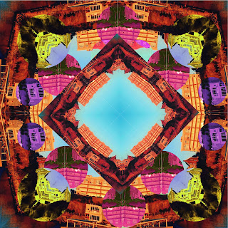
The Strongest part or area of my art piece has to be the colors I used to make the art appear colorful and like a kaleidoscope photograph. The shapes and design stands out a lot in my art, capturing the eyes due to so much details with the colors and shapes. I could improve on adding more shapes than just squares or circles. I could of also improve on the symmetry. The Biaxial symmetry could of improved my art work a lot, as well as the radial symmetry. Another improvement needed is making sure the shapes were lined perfectly since some were out of the correct measurements. The tools I used the most to create my work were mostly the rectangle marquee tool and hue/saturation for the colors.
I used the rectangle marquee tool select a layer and duplicate it. I used it along with the hue/saturation to make the rectangle a more different color than the rest of the art. The easy part was finding a color to make the art look like it stands out to the eye. Rotating the shapes and copying it was also easy after I got the hang of flipping and rotating them. The difficult part was selecting the Marquee tool and copying it since there was many errors saying the image or "space" was empty or not selected. Making the art in a perfect angle was also hard.
I demonstrated the objectives by demonstrating the different types of symmetry. I had balance in my competitions. I also did the three different types of kaleidoscope by using different angles of the picture. If i were to do this again, I would use different types of shape instead of just using squares and rectangles or converted symmetry. I would of followed the different type of symmetry to make the art work seem more interesting. To rate my effort on this project, I would give myself a 9 or 10. I worked very hard to follow all the directions on the kaleidoscope and worked hard throughout all class.


Larissa Andrade
ReplyDeleteIn each visuals one has a different type of colors one is brighter than the other while another is lighter which has a little darker color to it. The first kaleidoscope it's mostly made of circles and its rounder around the edges. The second contains a square shape that has another shape inside of it. The third kaleidoscope is made of of squares with a triangle shape inside of it. The composition is shown by how she arrange the shapes in different ways in the photo, the usage of bright colors and patterns and her symmetry is correctly shown.The strongest of the 3 three artworks would be the last kaleidoscope, there it contains bright colors the colors really stand out to people who would view this artwork and would notice the amount of effort put into it. What she could improve is that she could of made sure that they were lined up correctly by using the ruler tool to help improve her symmetry.
Effort: 4
ReplyDeleteComposition/Symmetry: 3 (some area's are not aligned correctly and are off kilter)
Submission of All work: 4
Craftsmanship: 3.5 (some small gaps in 1st image)
Artist Reflection: 3.5 (what kinds of symmetry did you use for each?)
18/20= A-
Great colors and designs! Use your ruler guidelines to make sure everything is placed straight.