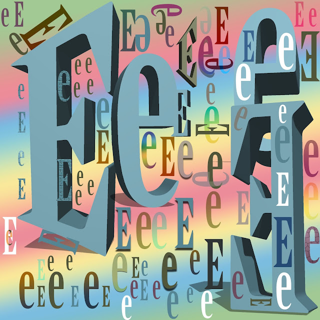
Letters E
To start, the strongest area or piece in my art has to be the 3D effects. By adding the 3D effect to my art, it made the picture stand out the most. It makes the art pop out and seem very detailed especially with the other colors and patterns combined. There are some improvements though that could have been made. I could of flip some letters around instead of keeping them in just one "straight row." More bright colors could of been used and more effects on the letters instead of just using the drop shadow or keeping it regular.
The most easy part was scattering the letters around, making patterns like the ones on the side, bottom, corner and in the 3D letters. It was also easy when I used the move tools to get the letters in the right position but it doesn't all need to be perfectly lined. The difficult part was finding a good color to match and look nice with the gradient background. It was hard to move the 3D letters since it wouldn't let me move them. It was also difficult to move them but I figured out a few minutes after. Following the rule of thirds was difficult as well since I didn't know how to fit the letters in the four corners. The effects to match was also difficult to do.
The most material I used was the move tool, 3D, wrap text and effects. Since I wanted the art to pop out, I focused most of my time on the 3D tool. I used the 3D tool to make the E more solid and appear to take most of the art. The effects I used for the letters were mostly hard light that made it appear like a light faint color. I used the move tool to have the letters perfectly placed around each other. To demonstrate the goal of this art, I followed all the instruction for the project. The goal was to make the letter pop out and look very interesting. Next time if I do this art activity, I'll try to use more effects on the letters and make the colors seem cool to fit with the background colors. I could of also added more layers of letters and play with more of the tools and cool effects. Following the rules of thirds as well could of made my art improve.


Effort: 4
ReplyDeleteComposition:3
Creativity/Originality:4
Elements/Principle Design:3
Art Reflection: 4
A-