Kaleidoscope Project

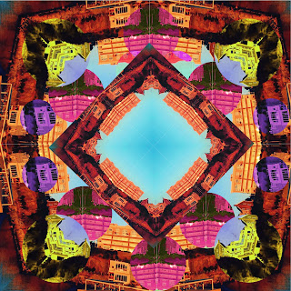
The Strongest part or area of my art piece has to be the colors I used to make the art appear colorful and like a kaleidoscope photograph. The shapes and design stands out a lot in my art, capturing the eyes due to so much details with the colors and shapes. I could improve on adding more shapes than just squares or circles. I could of also improve on the symmetry. The Biaxial symmetry could of improved my art work a lot, as well as the radial symmetry. Another improvement needed is making sure the shapes were lined perfectly since some were out of the correct measurements. The tools I used the most to create my work were mostly the rectangle marquee tool and hue/saturation for the colors. I used the rectangle marquee tool select a layer and duplicate it. I used it along with the hue/saturation to make the rectangle a more different color than the rest of the art. The easy part was finding a color to make the art look like it stands out to the eye. Rotating the shapes and ...