Posts

Showing posts from 2017

Grapes and Cherries art

Image
  The strongest part of my art is how i got the color correctly of the grapes and cherries. Its the strongest since it relates to the original image that i took. The color components is very creative. I can though, improve on my brush tool options. I could of tried to make the art/painting more realistic and detailed but i had difficulty with using the brush tool and getting the lines correctly in order for the painting to relate almost exactly like the original image. I used the brush tool, mixer brush, pencil, eyedropper, eraser and paint bucket. The pencil tool was used to outline the original image color components in order to apply the colors with the brush. The paint bucket was used to apply colors in a bigger area. The brush tool was used the most in order to brush in the colors after the eyedropper selects a color in a certain area.The mixer tool was used to mix in the colors. The easy part was finding different components of colors to color in after using the eyedr...

Bearpenfly

Image
The strongest area are the different animals i used to fit with the polar bear. What i need to improve is on cropping or painting the layer correctly so it doesn't look like its photoshopped. I had many difficulties when it came to adding the layers and background to the polar bear skin. To create this project, i mostly used the the brush tool and move tool to fix the layers in the right spot after adding another mask on top. Using the brush tool with the black and white colors was simple. These tools were used to add the layer of another animal to the original picture. The brush tool helped delete or add the layer of the animal. The easy part was finding pictures of animals to use for the photoshop but when it came to applying the layer,  it was extremely difficult. The background image looks very photoshopped compared to the animals i put together. It was hard to delete layers and put them back in order for it to look like it was not photoshopped. i met the requirements b...

Pop Art

Image
The strongest area of my art piece are the colors and the different number of levels and edge simplicity/fidelity. But I could improve on making the art appeal more by making it more detailed rather than simple. For this art, the most tools I used was the magic wand and paint bucket. I used these tools, like the wand to find a grey point, black or white to color them with pain bucket. Using the paint bucket was easy when it came to painting a certain area. The easy part was finding an edge simplicity that'll be easy to use the paint bucket to color in. I had some difficulties when the art was very detailed. There were parts that were different colors that made it hard for me to color. To make it much easier, I made the edge simplicity less detailed so almost everything was the same color. This made it much easier for me to color the art instead of having to zoom in to fill in a small piece. I demonstrated the objective or goal by using the magic wand and manipulating the...

Clone

Image
My strongest area is the color correction I made after I finished colliding the pictures together. The visual is neatly cropped to look like they were cloned.The poses were well too. I could improve on getting the image to look more appealing like having more clones or placing the clones in a better place. I could improved this by taking more than just the 7 pictures that i had originally took. If i had took more than just 7, i could of have better pictures to work with instead of using just those 7. It would of been easier for me to brush in the clones. The tools that I used the most to work with was the brush tool and move tool. I used the brush to get the image in with the rest and the move tool to perfectly set the image so when i did brush the clones, it would fit perfectly. The easy part was brushing the clone in after getting the measurements right. The difficult part was making the image was perfectly placed so nothing would be off. It was difficult be...

Kaleidoscope Project

Image
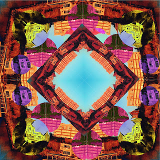
 The Strongest part or area of my art piece has to be the colors I used to make the art appear colorful and like a kaleidoscope photograph. The shapes and design stands out a lot in my art, capturing the eyes due to so much details with the colors and shapes. I could improve on adding more shapes than just squares or circles. I could of also improve on the symmetry. The Biaxial symmetry could of improved my art work a lot, as well as the radial symmetry. Another improvement needed is making sure the shapes were lined perfectly since some were out of the correct measurements. The tools I used the most to create my work were mostly the rectangle marquee tool and hue/saturation for the colors. I used the rectangle marquee tool select a layer and duplicate it. I used it along with the hue/saturation to make the rectangle a more different color than the rest of the art. The easy part was finding a color to make the art look like it stands out to the eye. Rotating the shapes and ...

Letters E

Image
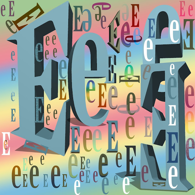
To start, the strongest area or piece in my art has to be the 3D effects. By adding the 3D effect to my art, it made the picture stand out the most. It makes the art pop out and seem very detailed especially with the other colors and patterns combined. There are some improvements though that could have been made. I could of flip some letters around instead of keeping them in just one "straight row." More bright colors could of been used and more effects on the letters instead of just using the drop shadow or keeping it regular. The most easy part was scattering the letters around, making patterns like the ones on the side, bottom, corner and in the 3D letters. It was also easy when I used the move tools to get the letters in the right position but it doesn't all need to be perfectly lined. The difficult part was finding a good color to match and look nice with the gradient background. It was hard to move the 3D letters since it wouldn't let me move them. It was...

Demo

Image